COVID-19 data — Why the data basis for situation assessment is problematic and how the problem can be solved
COVID-19 has been with us for more than a year, and political measures are being enforced to protect our health. These measures are mainly based on reported case numbers, e.g. by calculating a 7-day incidence. But are the reported case numbers suitable for a correct assessment of the situation? The following article examines the problems associated with the officially reported case numbers and how the problem can be solved. The graphics shown in the article are taken from the interactive COVID-19-Monitor Germany, which shows figures from the Robert Koch Institute and the Intensive Care Register.
Daily reported case numbers
Every day, the current case numbers for COVID-19 are published by the Robert Koch Institute. However, some health departments do not report numbers to the RKI on weekends. In addition, fewer tests are performed on weekends, which are then made up during the week. This leads to strong fluctuations in the reported case numbers. As a result, comparisons between days are not meaningful and trends are hard to discern.
This problem can be solved by smoothing the curve with a 7-day moving average (see Fig. 1). In this way, each day of the week is taken into account and the fluctuations caused by the day of the week are eliminated. The focus should therefore not be on the new case numbers reported each day. It is better to report the 7-day moving average and the change in the 7-day moving average from the previous day. In this way, a trend can be seen as opposed to comparing the reported number of cases to the previous day.

As can be seen from the mean, there was a sharp drop in the number of cases at the end of December, followed by a brief sharp rise, only to drop again further. Did such a fluctuation actually occur? Rather, it was because this was the time of the Christmas holidays and New Year’s Day. The RKI reports daily case numbers, which in turn were reported to the RKI by the public health departments. It seems that some health offices did not report case numbers over the holidays and then made up for it in early January. Can this be seen in the data?
Onset of disease
For this purpose, one can look at the so-called nowcast of the RKI (cf. Fig. 2). This is a calculation by the RKI, where an attempt is made to calculate the cases per day after the onset of the disease. The onset of the disease is used if it is known. If it is not known, it is approximated using the reporting date. The reporting date is the date when the case became known to the respective health authorities.
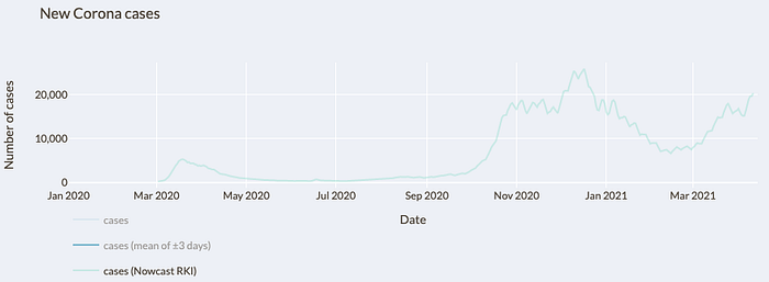
Even with the nowcast, one still recognizes fluctuations in the calculated case numbers after disease onset. But what is the reason for this? The RKI calculates the onset of disease for cases with unknown onset by multiple imputation. The most important parameter is the date of notification, i.e. the date when a case became known to the health authorities. If we look at the local peaks, they occur with an interval of 7 days. This is where the weekend phenomenon strikes again. If a 7-day moving average is calculated for the calculated number of cases after the onset of the disease, the effect can also be eliminated and the curve smoothed (see Fig. 3).
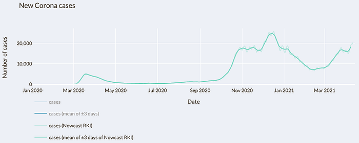
If we now look at the course of this curve, we see that the sharp drop in the number of cases followed by a short but steep rise is no longer the case. A slight dip can still be seen there. However, if we consider that the most important parameter for calculating the unknown onset of disease is the reporting date, and that some health authorities apparently did not report any figures to the RKI during this period, this slight dip may be due to the reporting behavior over the Christmas period. However, as will be seen later, there were also fewer tests during this period, so the dip may also be due to fewer tests being performed. Incidentally, the same effect may have occurred over the Easter holidays. This will become apparent over time.
Poorer data on onset of disease during the course of the pandemic
When looking at the nowcast figures, it is also noticeable that the fluctuations in the number of cases after the onset of the disease are greater in the second wave than in the first wave. For this purpose, one can look at the course of the reported case numbers, distinguishing between cases for which the onset of the disease is known and cases for which only the reporting date is known.

In the first wave, the onset of disease was known in a significantly higher proportion of cases than in the second wave (see Fig. 4). By July 31, 2020, there were 148,572 cases with known onset of disease and 63,736 cases without known onset of disease. Thus, in almost exactly 70% of the reported cases, the onset of disease was known. The situation is different for the second wave. There, the ratio of cases with known onset of disease and unknown onset of disease is 1,139,027 to 1,113,448, which means that in the second wave the onset of disease was known in about 50.7% of the reported cases. This can be explained by the change in testing behavior.
At the beginning of the pandemic, testing capacity was greatly increased. Thus, up to and including the 10th calendar week of 2020, there were a combined 69,184 PCR tests performed. In the 11th calendar week alone, there were then already 128,008 PCR tests performed, and in the 12th calendar week there were as many as 374,534. The number of PCR tests then remained quite stable for a while. During the summer and fall periods, the number of tests was then further expanded.

In the week before Easter, the number of tests performed fell compared to the previous week. Whether the number of tests performed remained stable up to and including Maundy Thursday and only fell from Good Friday onwards due to the public holidays, or already before, is not clear from the data. Since fewer tests were also conducted in the week after Easter, this may suggest that the effect was due to the Easter vacations.
Testing behavior has changed repeatedly over time. Initially, only individuals who were symptomatic and also had contact with a proven COVID-19 case or had returned from one of the few risk areas at the time were to be tested. Subsequently, individuals who only had symptoms were also tested. Then, in the summer, young, non-symptomatic travelers returning to the area were also tested. On the one hand, this lightened the dark field, but at the same time it also led to the addition of more asymptomatic cases in which the onset of the disease is not known.
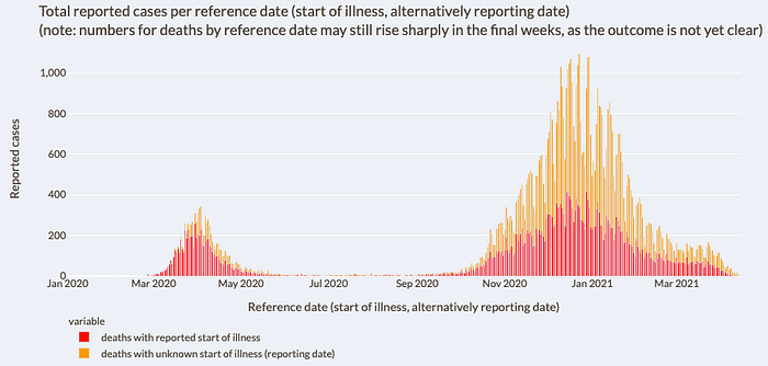
For reported deaths, the effect from first to second wave is even more pronounced (see Fig. 6). For deaths, there were 6,879 deaths with known onset of disease and 2,529 with unknown onset of disease by July 31, 2020. Thus, in the first wave, the onset of disease was known in approximately 73.1% of the reported deaths. In the period from August 1, 2020 to February 28, 2021, the onset of disease was known for 27,226 reported deaths, but not for 37,982, resulting in a rate of approximately 41.8%. While for the reported case numbers it is still easy to understand that the proportion of cases with known disease onset has fallen due to the change in testing strategy, this cannot be derived from the figures for the reported case numbers. Actually, persons deceased from COVID-19 should have shown symptoms before their demise, which would mean that the onset of disease would be known. The situation should not have changed between first and second wave. The question, why especially in the reported deaths the proportion of the known onset of the disease dropped from about 73.1% to 41.8% more than in the reported cases, remains unanswered with the available data. Since the beginning of the pandemic, the onset of the disease has been known in only about 45.7% of the reported deaths.
Start of infection
Let us briefly return to the RKI nowcast. As described above, the nowcast approximates the number of cases according to the onset of the disease. The onset of infection is further in the past. In order to visualize the course of the infection over time, the incubation period of 5–6 days must be subtracted in order to obtain the case numbers after the start of the infection in a simplified way.
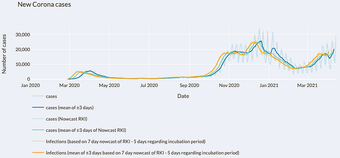
In the figure, the course of the Nowcast curve was shifted forward by 5 days in order to show the course of infection (cf. Fig. 7). Again, the calculation of the onset of the disease must be taken into account. As explained above, the most important parameter for calculating the onset of disease in cases with unknown onset is the date of notification. It is possible that the onset of disease is later than the reporting date due to early detection. In normal cases, however, the onset of the disease is likely to be before the reporting date. Since the onset of disease is not known for a large proportion of cases, especially in the second wave, it can be assumed that the course of cases after the onset of disease is to be located a few days earlier than the course of the nowcast curve shows. Accordingly, the course of the curve after the onset of infection would also shift somewhat into the past, which is why the shift of the nowcast curve by 5 days to visualize the occurrence of infection is chosen rather cautiously.
Death figures reported daily
In addition to the case numbers, the RKI also reports new deaths on a daily basis. As previously seen in the section “daily reported case numbers”, the daily reported case numbers are subject to strong fluctuations. These fluctuations also occur in the daily reported deaths, but to a much greater extent than in the reported case numbers (see Fig. 8).
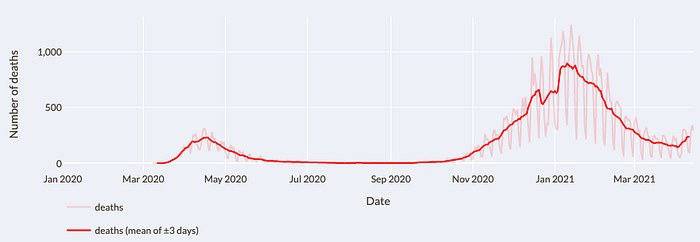
As a result, the lowest values reported within a week are significantly too low, while the highest values reported within a week are in turn significantly too high. The reported maximum value of 1,244 deaths includes many subsequent reports and is therefore significantly higher than the actual situation represented. A smoothing of the curve for a better assessment of the situation is again possible using a moving 7-day average.
The highest daily value for a 7-day moving average was 896. However, even this value still overestimates the situation. As with the reported case numbers, it is noticeable that the numbers of reported deaths plummet at the end of December and then rise abruptly at the beginning of January. Here, too, there is the effect of the days between Christmas and New Year’s Day, when the death figures were not reported by some agencies and then subsequently reported at the beginning of January. This results in the 7-day moving average for late December being too low and early to mid-January being too high. Had it not been for this peculiarity in reporting death counts, the actual high point for the 7-day moving average for death counts would probably be in the 800 range.
Comparability of case numbers over time
The changed test strategy with the significant increase in test capacities has the consequence that temporal comparability is hardly possible. If the test capacities are massively increased at the beginning and only symptomatic persons with an additional risk feature are tested, but later many asymptomatic persons are also tested, this leads to a changed pre-test probability. The pre-test probability indicates how likely a test is to be positive before the test has been performed. If a person is symptomatic and has also had contact with a demonstrably infected person, the pre-test probability is higher than if a PCR test is performed without symptoms and without a risk encounter. This is undoubtedly an advantage, because it brightens up the dark field. However, it also has the disadvantage of lacking comparability. Incidentally, this also means that a comparison of the 7-day incidence over time is not possible, which will be discussed later (see section “7-day incidence”).
Since the beginning of March 2021, the reported case numbers have been rising again. Of course, this may be because a third wave is heading our way. But could there be another reason? Can the sharp increase have (additional) other reasons? What has changed since the beginning of March in contrast to the time before? Since that time, there has been massive testing using rapid tests. Everyone can now buy rapid tests in discount stores and drugstores and test themselves. The fact that plenty of use has been made of this can be seen from the reported sell-outs of rapid tests in a very short time. In addition, there are now more and more test centers where people can be tested free of charge using rapid tests. In schools and kindergartens, too, teachers and educators are now regularly tested as standard — twice a week in our case — and school and daycare children can also be tested regularly. Of course, this also leads to a lightening of the dark field. But it also leads to a lack of comparability in the number of cases. Now, symptomless persons are tested at regular intervals. If a rapid test is positive, this rapid test is verified or falsified by means of a PCR test. However, a person who is tested by PCR and who has previously tested positive in a rapid test has a significantly higher pre-test probability. The positive rapid test makes it very likely that the PCR test will also be positive.
One might initially assume that the proportion of positives in the PCR tests performed would indicate whether more people are infected than a week earlier. However, as more of the PCR tests performed are with people who also previously tested positive in a rapid test, the expected pre-test probability also increases. The proportion of positives may also increase without the situation necessarily having changed. Of course, the situation may indeed have changed and more people may be infected. However, it cannot be reliably read from the reported case numbers. There are no statistics on how many rapid tests were carried out. That there is indeed a third wave can be seen from the figures for intensive care patients (see section on “Intensive care units”).
Changed age structure among those tested positive
It has been reported that the number of cases has increased, especially among younger people. This is not surprising. If the young population in the form of teachers, daycare center staff, schoolchildren and daycare center children are now regularly tested without any reason because they are asymptomatic, and young people in particular are often asymptomatically infected, young people in particular are now being reported as infected who would not have been detected without these rapid tests. This automatically increases the number of cases in the younger population in particular. This observation may also have occurred due to school openings. However, this cannot be reliably shown with the available figures due to the change in testing behavior. For this, a different method of investigation is needed.
A change in the average age of those infected is normal from a statistical point of view. In fact, it would be surprising if the average age did not decrease. What is the reason for this? At present, it is precisely the older, more vulneable population that has been vaccinated. If the vaccinations are effective, which can be assumed, it is precisely the older population group that is better protected against the virus. The older population group is therefore infected significantly less than before. This automatically leads to a lower average age of those infected. Especially if the dark field of the young population group in particular is now also lightened. However, this does not mean that the situation must have changed and that the virus has become more dangerous for younger people, for example, through mutations. It may be so, of course, but it cannot be reliably read from the given data. The same effect then occurs, of course, in the average age of intensive care patients. If now the vulneable, old population group is better protected, but the younger one is not yet, now less older people are treated with COVID-19 in the intensive care units. Again, this leads to a lower average age, without automatically implying that the virus must now have become more dangerous for younger people.
One way to expand the testing strategy is to have every employer provide rapid tests to their employees. The idea behind this, to lighten the dark field, is understandable. When assessing the situation, however, it must be taken into account that the number of cases will then also increase. This is normal when the dark field is lightened. However, it does not mean that the situation has changed. I will explain later on how the current situation can still be reliably assessed under the given circumstances.
7-day incidence
The calculation of the 7-day incidence of the RKI is based on the reported case numbers by reporting date. It is true that the number is set in relation to 100,000 inhabitants. Nevertheless, the course of the 7-day incidence value depends on the absolute reported case numbers. However, as previously shown, a change in testing strategy with more tests and a lightening of the dark field also leads to more detected cases without necessarily changing the situation. This then also leads to an increase in the 7-day incidence value. A comparability of the 7-day incidence values from the first wave, during which almost only symptomatic persons were tested, with the second wave, in which many asymptomatic persons were also tested, or even with the third wave, in which many persons are now also tested who previously showed a positive rapid test, is therefore not possible.
Another problem is that the 7-day incidence does not just map the past because it looks at cases in the last seven days. It maps even further into the past because it is based on reported case counts. As previously shown, the reported case numbers run about 1.5 weeks behind the actual infection event, so the 7-day incidence maps even further into the past.

Incidentally, I also consider the calculation of the 7-day incidence based on the reporting date to be problematic, regardless of the problems mentioned earlier. This time, however, because this leads to a somewhat too low 7-day incidence. Of the 13,245 cases reported on April 12, 2021, only 6,233 cases had a reporting date of April 11, 2021; the other cases had a reporting date further in the past. The further in the past the reporting date is for the newly reported cases, the lower the proportion of newly reported cases becomes (see Fig. 9). This leads to the fact that the number of cases before 7 days is quite stable, because hardly any subsequent reports are to be expected. For the last day, however, many subsequent reports can still be expected in the following days. The 7-day incidence calculated in this way is therefore somewhat too low. It is therefore better to calculate the 7-day incidence using the 7-day moving average. Although problems remain that comparability is not possible for the 7-day incidence due to the aforementioned circumstances. However, other data are not currently available, so this is currently the cleanest option.
However, there are other problems with the 7-day incidence. The set thresholds for 7-day incidence of 50, and 35, respectively, were defined during the first wave. At that time, fewer individuals were tested who also had a different pre-test probability because they were mostly symptomatic and had another risk characteristic, such as contact with a proven infected person. As testing capacity builds and the dark field lightens, a higher 7-day incidence does not automatically mean that we have a different situation during the second or third wave than during the first wave. However, with a value of 50 we would now have a less dramatic situation than with a value of 50 during the first wave.
R0 value
According to the RKI, the baseline reproduction number R0 indicates “the average number of people infected by an infected person, assuming that there is no immunity in the population and no infection prevention measures have been taken.” It is thus determined at the beginning of a pandemic. The R0 value is of great importance because, according to the RKI, infection prevention measures are derived from a high R0 value. The RKI gives the R0 value as 2.8–3.8. According to other studies, the R0 value is also given with values of 1.9[1], 2.2[2], 2.2[3] and 5.7[4]. Is the R0 value now between 2.8 and 3.8 at the value given by the RKI, or is it possibly above or below this value?

At the beginning of March 2020, the 7-day R value was actually 3.2, within their stated range of 2.8 to 3.8 (cf. Fig. 10). But does this value come about solely due to the propagation speed prevailing at that time? As explained earlier, it was precisely at this time that test capacities were massively expanded. As a reminder, up to and including the 10th calendar week of 2020, a total of 69,184 PCR tests were performed. In the 11th calendar week alone, there were then already 128,008 and in the 12th calendar week even 374,534 PCR tests performed. From the 11th to the 12th calendar week in 2020, the tests performed were thus tripled. This then leads to the fact that more persons with infections could be detected for whom no test could have been offered in the weeks before. A significant proportion of the high R value at that time is therefore very likely due to the fact that testing capacity was expanded so massively. The available figures indicate that the R0 value is below the range of 2.8–3.8 indicated by the RKI.
Intensive Care Units

That there is indeed a third wave can be seen from the occupied beds in the intensive care units. Since mid-March, the numbers of beds occupied by patients with a positive COVID-19 test have been rising again there (cf. Fig. 11). Based on the development, it has been reported that this could result in the intensive care beds being completely occupied within the next 3–4 weeks. In order to be able to estimate this somewhat more precisely, it is worth taking a look at the daily new admissions of patients with positive COVID-19 tests to the intensive care units (cf. Fig. 12).
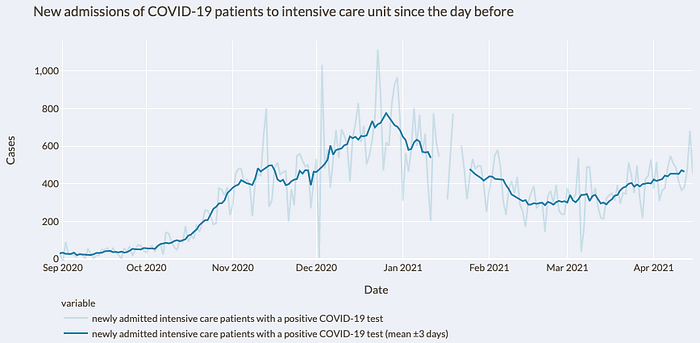
New admissions fell steadily until mid-February 2021. From then until around mid-March 2021, new admissions remained stable and then rose again. The exponential growth observed in daily new case reports cannot be seen in the same way in ICU new admissions. The daily new ICU admissions increased from the low point after the second wave by about 63% so far, whereas the reported case numbers increased by about 169%. On the one hand, this may be because the exponential growth in reported case numbers has occurred mainly due to the clearing of the dark field by the massively used rapid tests. On the other hand, it is also possible that the particularly at-risk group is now better protected due to vaccinations already administered. Without a suitable study design, this cannot be reliably read from the available figures.
It is true that it can take some time for an infected person to be treated in the intensive care unit. However, 5–6 days elapse from infection to onset of illness. In most cases, people do not go to the doctor until then, whereupon a test is performed. The result is only available after more than one day, which is then reported to the health authorities, which in turn only then transmit the case numbers to the RKI. When comparing the curve of reported case numbers with the curve of case numbers after the start of infection, a time offset of about 1.5 weeks can also be seen. When comparing the new ICU admissions with the reported case numbers, it can be seen that the time offset of the high points is approximately 5 days. The stronger increase in the number of cases would therefore already have been reflected in the new admissions to the intensive care unit.
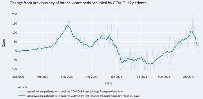
Initially, the increase in the number of additional ICU beds occupied daily by COVID-19 patients accelerated. For a few days, the increase has slowed down again and the number of additional ICU beds occupied daily has been falling (see Fig. 13). Also in Figure 11, it can be seen how the curve of ICU beds occupied by COVID-19 patients is flattening. Based on the available figures on the current situation in intensive care units, it cannot be assumed that more than 6,000 patients with a positive COVID-19 test will be in intensive care units by the end of April, as predicted by the President of the German Interdisciplinary Association for Intensive Care and Emergency Medicine.

At the beginning of September 2020, just over 200 ICU beds of the approximately 21,500 occupied ICU beds were occupied by patients who tested positive for COVID-19. Although the number of ICU beds occupied by patients testing positive for COVID-19 increased by more than 5,500 by January 03, 2021, the total number of ICU beds occupied increased by only about 1,000 (see Fig. 14). By March 10, 2021, ICU beds occupied by patients testing positive for COVID-19 fell by about 3,000, yet the number of total ICU beds occupied fell by less than 500. Since then, ICU beds occupied by patients testing positive for COVID-19 increased by about 1,950 by April 14, 2021. 2021 by about 1,950 again, the total occupied ICU beds nevertheless never increased by more than 500. It can be seen that the number of total occupied ICU beds does not grow or fall with the same number as the number of ICU beds occupied by patients with positive COVID-19 test does. Therefore, it is likely that this finding will continue to be observed as the numbers increase again. Of course, the numbers only reflect ICU bed capacity and not the situation of the nursing staff. According to the DIVI Intensive Care Register, this behavior occurs because hospitals switch from regular to emergency operation. Accordingly, scheduled operations are canceled or postponed and other patients are transferred to other wards earlier than usual.

There are also problems of comparability over time in the figures for occupied intensive care beds. Over time, all persons admitted to inpatient hospitals were tested for COVID-19 by default. As a result, there were incidental detections because, for example, pregnant women were tested prior to their delivery or individuals admitted for an accident. For hospitals, the distinction may not matter much because these patients must also be isolated. However, it is problematic for the correct situation assessment regarding persons who are in intensive care units because of COVID-19.
Ways to obtain clean figures
So far, it has been shown why the reported case numbers are hardly suitable for reflecting the actual situation and even less for ensuring comparability over time. Since no other figures are available to date, it is of course necessary to use the figures that are available to assess the situation. However, one must always keep the previously mentioned problems in mind and include them when assessing the situation.
But is there no other way to obtain reliable data in order to be able to assess the situation correctly in the long term? With a clean study design this is possible. To do this, you need a group of people that is representative of the German population. If, for example, 200,000 people from Germany are selected (around 0.25% of the population) and tested at regular intervals, the situation for Germany can be extrapolated from the figures obtained in this way. The 200,000 people should be representative of Germany, for example in terms of the age structure and distribution of people in Germany. A smaller number of people can also be used. However, the larger the number of tests, the more meaningful the figures obtained in this way.
The interval between tests should be regular, for example every 7 days. An interval of 4 days would also be possible, because then a cleanly calculated R-value would also be obtained. When calculating the R-value, the case numbers of the last 4 days are put in relation to the 4 days before. Due to the study design, in addition to the R-value, one would also be able to very cleanly extrapolate how many people are actually currently infected. Since the group to be tested would be representative for Germany and the testing would not depend on the current testing strategy, the dark field can also be determined directly. As an aside, it would also be possible to calculate other key figures, such as how many people are actually symptomatic and how high the 7-day incidence actually is. However, the 7-day incidence value would then be significantly higher than it is currently calculated, since the dark field would be completely brightened. This would then have to be taken into account accordingly in the situation assessment. In addition, one would also have an exact age distribution of the infected persons and how the age distribution changes over time. One would also know which groups of people have become infected, for example, which groups of employees or nursing home residents. This number would then also no longer depend on the currently valid test strategy, which would mean that the result could not be falsified accordingly. Furthermore, it would be possible to calculate very precisely how the current virus variants circulate in the population.
With each test, a new number of people can be tested, which would then be representative for Germany. However, testing always the same group of people would have further advantages. It would be possible to determine the Ct value in each case and see how this develops over time and at which Ct values the persons are symptomatic. Ct value here stands for “Threshold Cycle” and indicates how many cycles had to be run in the PCR test until a positive signal was achieved. Therefore, the higher the value, the lower the viral load of the sample. One could additionally perform antibody tests and determine after how many days antibodies are formed and how long the antibodies are detectable. One could also determine how low the Ct value was in individuals who developed antibodies. Since only about 0.25% of the population would have been tested, if the test group were maintained, the deceased in this group could be autopsied by default to determine how many died of corona. That would have been about 200 people to date. Thus, a clean infected case mortality rate (IFR) could be calculated.
For ICU patient numbers, it would be necessary to report the number of ICU beds occupied by patients with a positive COVID-19 test but who are receiving ICU care for something else, in addition to the number of ICU beds treated for COVID-19.
Thus, with a well-chosen study design, it is possible to obtain reliable numbers. The figures obtained in this way would leave little room for interpretation, which is why this would also remove the basis for conspiracy theories.
Bibliography
[1] Joseph T. Wu, Kathy Leung, Mary Bushman, Nishant Kishore, Rene Niehus, Pablo M. de Salazar, Benjamin J. Cowling, Marc Lipsitch, Gabriel M. Leung: Estimating clinical severity of COVID-19 from the transmission dynamics in Wuhan, China. In: Nature Medicine. March 19, 2020, ISSN 1546–170X, S. 1–5. doi:10.1038/s41591–020–0822–7.
[2] Julien Riou, Christian L. Althaus: Pattern of early human-to-human transmission of Wuhan 2019 novel coronavirus (2019-nCoV), December 2019 to January 2020. In: Eurosurveillance. 25, Nr. 4, 2020. doi:10.2807/1560–7917.ES.2020.25.4.2000058. PMID 32019669. PMC 7001239
[3] Q. Li, X. Guan, P. Wu, X. Wang, L. Zhou, Y. Tong, R. Ren, K.S. Leung, E.H. Lau, J.Y. Wong, X. Xing, N. Xiang, Y. Wu, C. Li, Q. Chen, D. Li, T. Liu, J. Zhao, M. Li, W. Tu, C. Chen, L. Jin, R. Yang, Q. Wang, S. Zhou, R. Wang, H. Liu, Y. Luo, Y. Liu, G. Shao, H. Li, Z. Tao, Y. Yang, Z. Deng, B. Liu, Z. Ma, Y. Zhang, G. Shi, T.T. Lam, J.T. Wu, G.F. Gao, B.J. Cowling, B. Yang, G.M. Leung, Z. Feng Z: Early Transmission Dynamics in Wuhan, China, of Novel Coronavirus-Infected Pneumonia. In: The New England Journal of Medicine. Januar 2020.
[4] S. Sanche, Y.T. Lin, C. Xu, E. Romero-Severson, N. Hengartner, R. Ke: High Contagiousness and Rapid Spread of Severe Acute Respiratory Syndrome Coronavirus 2. In: Emerging Infectious Diseases. Band 26, Nr. 7, 2020, doi:10.3201/eid2607.200282
